|
|
Post by Fading Fast on Sept 12, 2024 7:41:32 GMT
Fading Fast, Ben Mankiewicz is stylin' tonight on T CM... It looks like he's sporting New York pinstripes, and upon further inspection, I wonder about the flat color/stripes rule here: When wearing a striped shirt, a flat one-color tie is suggested or vice-versa, but what is considered correct when the dress suit is striped? Mankiewicz is wearing a one-color tie to contrast with the striped jacket, but the tie looks like it's breaking with the non-striped shirt rule. I see BunnyWhit is currently online: Feel free to jump in as well, BunnyWhit!
Getting a little closer to your question, if the suit has a muted pattern - pinstripes that don't jump out at you - then it's usually easier to mix in a patterned shirt and/or tie, but if the suit's pattern is bold, then one has to be very careful to choose quiet patterns of the right scale and tone for the shirt/tie or all hell can break out visually as the suit commands a lot of "real estate."
While the above are, I believe anyway, reasonable guidelines, your "eye -" your ability to truly see what blends harmoniously - matters. Generally, I think Ben is okay and has good eye, but he occasionally strays into some questionable combinations as, as you note, he likes being adventurous. It usually works for him, but sometimes his outfits have a few patterns banging into each other.
|
|
|
|
Post by NoShear on Sept 12, 2024 15:04:13 GMT
Fading Fast, Ben Mankiewicz is stylin' tonight on T CM... It looks like he's sporting New York pinstripes, and upon further inspection, I wonder about the flat color/stripes rule here: When wearing a striped shirt, a flat one-color tie is suggested or vice-versa, but what is considered correct when the dress suit is striped? Mankiewicz is wearing a one-color tie to contrast with the striped jacket, but the tie looks like it's breaking with the non-striped shirt rule. I see BunnyWhit is currently online: Feel free to jump in as well, BunnyWhit!
Getting a little closer to your question, if the suit has a muted pattern - pinstripes that don't jump out at you - then it's usually easier to mix in a patterned shirt and/or tie, but if the suit's pattern is bold, then one has to be very careful to choose quiet patterns of the right scale and tone for the shirt/tie or all hell can break out visually as the suit commands a lot of "real estate."
While the above are, I believe anyway, reasonable guidelines, your "eye -" your ability to truly see what blends harmoniously - matters. Generally, I think Ben is okay and has good eye, but he occasionally strays into some questionable combinations as, as you note, he likes being adventurous. It usually works for him, but sometimes his outfits have a few patterns banging into each other.
Thank you for your lengthy response, Fading Fast... The outfit, which included a yellow gold tie from this television eye's view, looked like it would not have been out-of-place for Academy Award dress. |
|
|
|
Post by lonesomepolecat on Sept 15, 2024 6:16:59 GMT
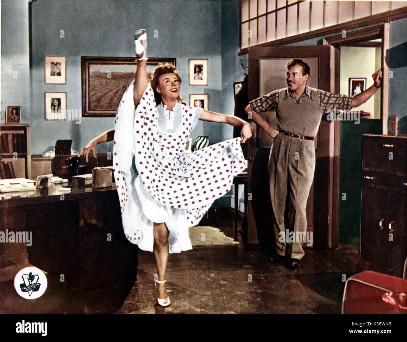
I just watched HAPPY GO LOVELY for the first time and was in love with Vera Ellen's cute New Look-era outfits!
Not sure if this outfit was in HAPPY GO LOVELY, but it popped up in my search so I had to share: |
|
|
|
Post by BunnyWhit on Sept 15, 2024 17:53:50 GMT
I just watched HAPPY GO LOVELY for the first time and was in love with Vera Ellen's cute New Look-era outfits!
 Costumer Anna Duse made Diane Hart cute as a bug in this film as well, though part of me wishes she didn't always have a cap. I assume that is a part of the character. Just look at the wonderful construction on the blue number she's wearing above. The fitted midriff and underbust gathers do awfully nice things for her figure! Costumer Anna Duse made Diane Hart cute as a bug in this film as well, though part of me wishes she didn't always have a cap. I assume that is a part of the character. Just look at the wonderful construction on the blue number she's wearing above. The fitted midriff and underbust gathers do awfully nice things for her figure!
I've not seen the film, LonesomePolecat, but I very much enjoyed looking at photos of the wonderful costumes in which the entire cast is outfitted. I'm putting this one on my watch list!
When you're done looking at Vera's legs.....check out the amazing outfit on Diane!

Everyone looking mid-century cute at rehearsal.....even him!
 |
|
|
|
Post by Andrea Doria on Sept 15, 2024 18:12:56 GMT
Vera was made for the New Look! Her tiny waist made those outfits look so feminine after the 40's shoulder pads. {Love your new avatar, lonesomepolecat!} |
|
|
|
Post by Fading Fast on Sept 15, 2024 18:25:34 GMT
Since there's no easy way to reply to multiple parts of one post, all the quotes (in bold) are from BunnyWhit's outstanding previous post (excepting the last one).
"Costumer Anna Duse made Diane Hart cute as a bug"
She really does look adorable. She's cute, but the right clothes really do a lot.
"I'm putting this one on my watch list!"
Ditto.
"When you're done looking at Vera's legs.....check out the amazing outfit on Diane!"
Look at that, you're right, there is someone else in that picture.
"Everyone looking mid-century cute at rehearsal.....even him!"
Perfectly said.
And a hat tip to Andrea Doria for this spot-on comment:
"Vera was made for the New Look! Her tiny waist made those outfits look so feminine after the 40's shoulder pads."
|
|
|
|
Post by lonesomepolecat on Sept 15, 2024 18:54:10 GMT
I just watched HAPPY GO LOVELY for the first time and was in love with Vera Ellen's cute New Look-era outfits!
 Costumer Anna Duse made Diane Hart cute as a bug in this film as well, though part of me wishes she didn't always have a cap. I assume that is a part of the character. Just look at the wonderful construction on the blue number she's wearing above. The fitted midriff and underbust gathers do awfully nice things for her figure! Costumer Anna Duse made Diane Hart cute as a bug in this film as well, though part of me wishes she didn't always have a cap. I assume that is a part of the character. Just look at the wonderful construction on the blue number she's wearing above. The fitted midriff and underbust gathers do awfully nice things for her figure!
I've not seen the film, LonesomePolecat, but I very much enjoyed looking at photos of the wonderful costumes in which the entire cast is outfitted. I'm putting this one on my watch list!
When you're done looking at Vera's legs.....check out the amazing outfit on Diane!

Everyone looking mid-century cute at rehearsal.....even him!
 The movie was very enjoyable. I never would have paired Vera Ellen with David Niven but I feel like they were great together. (I love Niven to bits anyway so I’m biased). And Cesar Romero is a funny director character (imitating someone he’s met perhaps?). But since the love interest isn’t in “the show” with Vera Ellen, it frees her up for some cool dance numbers on pointe and with her usual ridiculous difficulty. BTW The fur in the movie was called “silver mink”. |
|
|
|
Post by NoShear on Sept 17, 2024 15:15:10 GMT
For Fading Fast... Stylin' a requisite beret and smooth hand gestures:  - Capitaine Renard should've reimbursed Captain Morgan the 825, still leaving him 575 for vicuna attire and more berets. |
|
|
|
Post by BunnyWhit on Sept 17, 2024 16:01:13 GMT
For Fading Fast... Stylin' a requisite beret and smooth hand gestures:  - Capitaine Renard should've reimbursed Captain Morgan the 825, still leaving him 575 for vicuna attire and more berets.
|
|
|
|
Post by NoShear on Sept 17, 2024 16:14:04 GMT
For Fading Fast... Stylin' a requisite beret and smooth hand gestures:  - Capitaine Renard should've reimbursed Captain Morgan the 825, still leaving him 575 for vicuna attire and more berets.
Laughing, BunnyWhit!! |
|
|
|
Post by Fading Fast on Sept 18, 2024 9:39:13 GMT
I just posted a review of the 1952 movie "The Steel Trap" here: "The Steel Trap"
The clothes in it are classic 1950s American. I think they are a bit nicer than the characters could probably afford as he's a mid-level bank employee, which in those days, did not pay a lot of money, but it was a stable job. Regardless, their wardrobes are enjoyable to see.
In this picture, star Joseph Cotton is sporting a fedora, a perfect medium-gray pinstripe suit, a button-down-collar shirt, and (my guess) a grenadine tie. He looks like he just walked out of Brooks Brothers. You can see the pieces of her, Teresa Wright's, outfit a bit better in the following pictures.

Love the collar, buttons and white piping (if it's piping - BunnyWhit?).

This coat looks a bit more styling than I think they could afford (who buys an all-white winter coat on a budget?), but it is really cool – check out its collar.

And finally, suspenders for him and the classic "just out of the shower" towel for lovely her.

|
|
|
|
Post by BunnyWhit on Sept 19, 2024 23:10:11 GMT
Love the collar, buttons and white piping (if it's piping - BunnyWhit?).

My answer is yes. And no. See? Complicated.
I looked at all the photos I could find of Teresa Wright in this sweater, but that still left me with some questions, so I went to the film. It helped a lot to see her moving around in the garment so that I could better tell what that little edge stripe was doing.
I originally thought it might be simply a stripe knitted with a contrasting color along the buttonhole edge. That sort of thing was not/is not uncommon. But I also noticed that she is wearing the last two buttons open, and that shows a wider strip of that -- I'll call it white -- color on the button side of the sweater. Also, while she is in the kitchen cooking Joseph Cotten's eggs, and a little bit as she's sitting in his lap here, it looks like the right side of the neck edge comes out from under the collar ever so slightly, and the white strip is there as well.
From this angle you can tell that both edges of the sweater have that wide contrast.

All of this gave me what I think might be the answer: mock piping! (Is that groans I hear from the peanut gallery?)
Though it is not as prevalent today, in the 1950s most sweaters had an interior stabilizing fabric, usually made of petersham or an additional knitted piece, along the button and buttonhole edges. This serves a few purposes. It protects the knitted fabric from being pulled out of shape or torn by the buttons. Buttons sewn on with thread can actually cut through the knit. This also keeps the edges from rolling or stretching out of shape, keeps the bottom edge from splaying or curling out, and helps to prevent puckering or gaping at the bust. Plus, it just feels properly finished this way.
Petersham is typically kept hidden, but when a separate knitted piece is used it often lines the entire edge of the garment instead of only in the button area, and this becomes much like a facing. It still serves the same purposes, but it also serves to give the garment a bit more structure so that it doesn't look rumpled after repeated wearings. Usually these separate pieces are knitted in a tube and applied, and therefore that edge becomes thicker, and it ends up poking out past the edge of the garment and looking like a piping.
I found some photos of a men's sweater from the same time period as The Steel Trap (early 1950s) that illustrates what I mean.
Here's the contrasting stripe all round the sweater edge.

Here is the knitted facing from the inside neckline. You can tell that the applied pieced is tubular.

And here is the center front at the buttons and buttonholes.

It's a twofer -- this sweater also has the petersham! It's intended to be an activewear sweater, so I'm sure having both elements added to the life of the garment. Usually it is the goal to make buttonholes in the center of the petersham, but this one uses the technique of removing a small wedge from the edge of the ribbon. This allows the buttonhole to be stabilized but also leaves more room for stretch so that the button can easily pass through all that thickness.The edge would be likely to distort and the buttons would be difficult to pass through otherwise.
It's amazing how much there can be to say about one simple garment. Cashmere was extremely popular in this time period, and I assume this sweater to be just that, but it also could be lambswool. It fits her well and she looks and moves in it as if she's very comfortable.
|
|
|
|
Post by Fading Fast on Sept 20, 2024 7:39:09 GMT
Love the collar, buttons and white piping (if it's piping - BunnyWhit?).

My answer is yes. And no. See? Complicated.
I looked at all the photos I could find of Teresa Wright in this sweater, but that still left me with some questions, so I went to the film. It helped a lot to see her moving around in the garment so that I could better tell what that little edge stripe was doing.
I originally thought it might be simply a stripe knitted with a contrasting color along the buttonhole edge. That sort of thing was not/is not uncommon. But I also noticed that she is wearing the last two buttons open, and that shows a wider strip of that -- I'll call it white -- color on the button side of the sweater. Also, while she is in the kitchen cooking Joseph Cotten's eggs, and a little bit as she's sitting in his lap here, it looks like the right side of the neck edge comes out from under the collar ever so slightly, and the white strip is there as well.
From this angle you can tell that both edges of the sweater have that wide contrast.

All of this gave me what I think might be the answer: mock piping! (Is that groans I hear from the peanut gallery?)
Though it is not as prevalent today, in the 1950s most sweaters had an interior stabilizing fabric, usually made of petersham or an additional knitted piece, along the button and buttonhole edges. This serves a few purposes. It protects the knitted fabric from being pulled out of shape or torn by the buttons. Buttons sewn on with thread can actually cut through the knit. This also keeps the edges from rolling or stretching out of shape, keeps the bottom edge from splaying or curling out, and helps to prevent puckering or gaping at the bust. Plus, it just feels properly finished this way.
Petersham is typically kept hidden, but when a separate knitted piece is used it often lines the entire edge of the garment instead of only in the button area, and this becomes much like a facing. It still serves the same purposes, but it also serves to give the garment a bit more structure so that it doesn't look rumpled after repeated wearings. Usually these separate pieces are knitted in a tube and applied, and therefore that edge becomes thicker, and it ends up poking out past the edge of the garment and looking like a piping.
I found some photos of a men's sweater from the same time period as The Steel Trap (early 1950s) that illustrates what I mean.
Here's the contrasting stripe all round the sweater edge.

Here is the knitted facing from the inside neckline. You can tell that the applied pieced is tubular.

And here is the center front at the buttons and buttonholes.

It's a twofer -- this sweater also has the petersham! It's intended to be an activewear sweater, so I'm sure having both elements added to the life of the garment. Usually it is the goal to make buttonholes in the center of the petersham, but this one uses the technique of removing a small wedge from the edge of the ribbon. This allows the buttonhole to be stabilized but also leaves more room for stretch so that the button can easily pass through all that thickness.The edge would be likely to distort and the buttons would be difficult to pass through otherwise.
It's amazing how much there can be to say about one simple garment. Cashmere was extremely popular in this time period, and I assume this sweater to be just that, but it also could be lambswool. It fits her well and she looks and moves in it as if she's very comfortable.
|
|
|
|
Post by NoShear on Sept 20, 2024 17:11:50 GMT
Fading Fast, think I previously posted about the exotic colonial Africa attire seen in "CLARENCE the CROSS-EYED LION" but thought of you with the berets again:  |
|
|
|
Post by BunnyWhit on Sept 20, 2024 22:52:27 GMT
What a fantastic explanation, thank you. I love learning these details (you've taught me so much - I'll never look at Swiss dots and polka dots casually ever again). The pictures here are awesome as they perfectly complement your very clear and detailed explanation. I have some sweaters with "petersham," but never knew that's what it is called. My sweaters with petersham, like the one in the picture, look like the petersham is a silk grosgrain, but that's just a guess. Thank you again for the wonderful explanation.
Grosgrain is named for the weave. Both what we call grosgrain ribbon and petersham ribbon are the grosgrain weave, but they are different because of their edges.
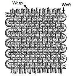
Grosgrain weave is accomplished by using a heavier weight weft on a lighter weight warp to achieve the familiar texture. Unlike a satin ribbon, grosgrain looks the same on both sides. Occasionally you might also see this called a "corded" weave.

Petersham ribbon has a sawtooth edge. (Ribbon photos courtesy of petershams.com, a UK online millinery supplier. It's fun to snoop around their site, if you're so inclined.)

Petersham is simply woven back and forth without wrapping the end warp threads on each pass. This is what creates what some call an unfinished edge. You might also see it called a picot edge. Because the edges are unstabilized in this way, petersham is easy to manipulate around curves. Though the ribbon still provides stability, it also retains flexibility, making it a beautiful choice for these sweater facings, as hem bindings, or waistband facings. It is also sometimes used on the interiors of corsetry or multi-pieced fitted bodices, such as shirtwaists or gowns.
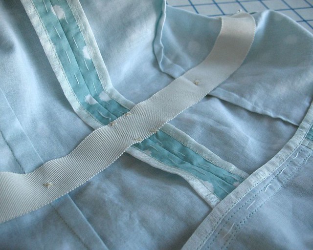
In this photo, petersham ribbon is added to the garment as a waist stay. This is important to help the garment keep its shape. Even though this is a light weight dress, the stay will take some of the pressure off the long shaping darts. Petersham would be much more comfortable here than grosgrain. (And might I add – what lovely Hong Kong finished seams! I love to see garments made with this level of care.)

Petersham can be used as surface embellishments as well, and was popular on 19th century gowns when ruched in all-over meandering patterns or swirled into dimensional rosettes. Petersham makes beautiful hat bands.
Grosgrain ribbon has a straight edge.

Grosgrain is woven with each pass wrapping around the end warp threads, creating a selvedge. This edge is sturdy and unyielding, adding additional strength. Because of this difference, grosgrain is difficult to form around curves. Frankly, it’s next to impossible to do and make it look good unless the curve is a very gentle one. Even then, it is difficult to apply without puckers or edges that float slightly above the fabric rather than sitting next to it.
Here is a circa 1950s cashmere sweater decorated with grosgrain and embroidered poodles.

See how puckery it is? Those cuffs just make me sad. The ribbon is too set in its ways to give and move with the knitted fabric. Notice also how the ribbon is folded over at the neck edge to head around the collar (and the back view of this sweater shows it coming into a point at the back). These things really illustrate how unsuitable grosgrain is for anything other than straight lines.
Grosgrain is sometimes used as a hem tape, but only if the hem is straight, no flare. It also is sometimes used as a waist tape (rather than twill) in corsetry and bodices.
Here is a reproduction gown bodice which employs a grosgrain waist tape. In this instance, because the bodice is closely fitted, multi-pieced, and boned, the sturdiness of grosgrain is a great choice. Notice at the neck edge, over where the stand up lace is attached to the garment, this seamstress also used petersham. Super!

Grosgrain can be used as surface embellishment in straight line applications, such as a tuxedo braid for the man who prefers a more matte appearance than satin offers. Because of its strength, heavy duty grosgrain is used for cargo and packing webbing as it resists longitudinal stretch. It is also used in safety tape for high-visibility applications such as on firefighter apparel, and milspec grosgrain is used for reinforcement, ties, and binding purposes.
|
|


