|
|
Post by Fading Fast on Dec 3, 2022 14:05:23 GMT
Does anyone have any thoughts about the new IMDB page layouts?
I don't get why IMBD made these changes: the pages seem harder to use as they require more clicks to get all the information out and they take longer to load. Also, some of the text seems more congested, which makes it harder to read. Perhaps it isn't, but that is the feel I'm getting.
While the pages look a bit fancier, they are less user friendly.
Maybe I'm just missing the positives / good improvements, so I was wondering what others thought about them?
Thank you.
|
|
|
|
Post by topbilled on Dec 3, 2022 14:54:00 GMT
Does anyone have any thoughts about the new IMDB page layouts?
I don't get why IMBD made these changes: the pages seem harder to use as they require more clicks to get all the information out and they take longer to load. Also, some of the text seems more congested, which makes it harder to read. Perhaps it isn't, but that is the feel I'm getting.
While the pages look a bit fancier, they are less user friendly.
Maybe I'm just missing the positives / good improvements, so I was wondering what others thought about them?
Thank you.
Pluses: when you visit an actor's page, all you have to do is click Expand Below and their entire filmography comes up fast without a lot of hassle loading the info. And if I do a control-F (Find) I can quickly locate a title for said actor.
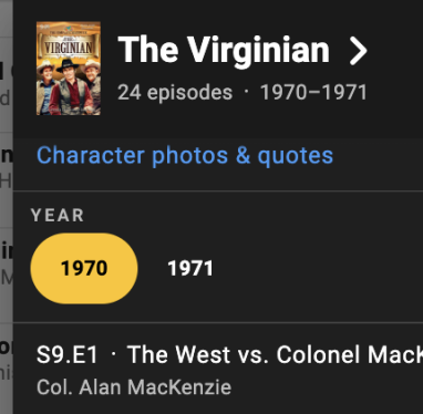
But the best plus, in my opinion is how you can look up TV listings faster. If you click on the number of episodes in which they appear, then you get a pop-up which sorts their performances by year. This makes things much easier when you are trying to find a certain episode.


|
|
|
|
Post by Fading Fast on Dec 3, 2022 15:30:37 GMT
Does anyone have any thoughts about the new IMDB page layouts?
I don't get why IMBD made these changes: the pages seem harder to use as they require more clicks to get all the information out and they take longer to load. Also, some of the text seems more congested, which makes it harder to read. Perhaps it isn't, but that is the feel I'm getting.
While the pages look a bit fancier, they are less user friendly.
Maybe I'm just missing the positives / good improvements, so I was wondering what others thought about them?
Thank you.
Pluses: when you visit an actor's page, all you have to do is click Expand Below and their entire filmography comes up fast without a lot of hassle loading the info. And if I do a control-F (Find) I can quickly locate a title for said actor.
But the best plus, in my opinion is how you can look up TV listings faster. If you click on the number of episodes in which they appear, then you get a pop-up which sorts their performances by year. This makes things much easier when you are trying to find a certain episode.


|
|
|
|
Post by topbilled on Dec 3, 2022 15:42:12 GMT
I will admit that it took some time to warm up to the changes. But now I like this layout.
Pluses: when you visit an actor's page, all you have to do is click Expand Below and their entire filmography comes up fast without a lot of hassle loading the info. And if I do a control-F (Find) I can quickly locate a title for said actor.
But the best plus, in my opinion is how you can look up TV listings faster. If you click on the number of episodes in which they appear, then you get a pop-up which sorts their performances by year. This makes things much easier when you are trying to find a certain episode.


|
|
|
|
Post by BunnyWhit on Dec 3, 2022 16:09:13 GMT
Does anyone have any thoughts about the new IMDB page layouts?
I don't get why IMBD made these changes: the pages seem harder to use as they require more clicks to get all the information out and they take longer to load. Also, some of the text seems more congested, which makes it harder to read. Perhaps it isn't, but that is the feel I'm getting.
While the pages look a bit fancier, they are less user friendly.
Maybe I'm just missing the positives / good improvements, so I was wondering what others thought about them?
Thank you. I'm glad to know I'm not the only one who doesn't love the new layout. Admittedly, as you say, it looks more attractive (modern/slicker), but I also find that there seems to be more clicking required. I have found that if I want to look at the filmography for an actor, "expand below" is an extra click to see the entire list. That might not be such a big deal ordinarily, but if I then go take a look at the page for a particular film, if I spend more than a few seconds there, I then must "expand" again when I go back to the main listing. If I want to look at the pages for several different films in a list, that requires a lot of clicking. Perhaps I'm just using it incorrectly, but that procedure was not required of the last layout. Also, because the main listing takes up more space now, there is more scrolling required. I keep thinking I'm going to get used to it and decide I like it, but so far it kind of seems like more "work". I have wondered, though, if that simply is because of how I use it. For example, it is common for me to sit down and want to read many or all of the individual film pages for a particular actor. I'm sure many of us here do that. (Note) The IMDb format for the casual user is probably great, but for those who want to do some studying it seems a bit more cumbersome than it used to be. (Note: I'd be interested to learn how this group uses IBDb the same or differently. I do the quick information-getting searches of course, but I also spend the time to study. It's just like looking up a word in the dictionary. Sure, most people find the word and get out, but I always found that looking up a word took half an hour or better because I never could stop at just one!) |
|
|
|
Post by BingFan on Dec 3, 2022 16:17:08 GMT
My wife opens up IMDB on her iPad whenever we’re watching an old movie or TV show — we often consult it while viewing — and she’s been having trouble with it, noting changes like the ones FF identities that make the site harder to use.
Interestingly, because my iPad uses older software than my wife’s, I still get the “old” IMDB when I open the site. I almost don’t want the next iPad software update because I don’t want to lose access to the “old” IMDB. (On the other hand, I don’t want to be a Luddite when it comes to this kind of stuff.)
Even though I know I’ll get used to the new IMDB whenever I’m finally forced to use it, I have to say that I’ve never met a software update that truly seemed like an improvement over what came before.
|
|
|
|
Post by Fading Fast on Dec 3, 2022 16:19:05 GMT
Does anyone have any thoughts about the new IMDB page layouts?
I don't get why IMBD made these changes: the pages seem harder to use as they require more clicks to get all the information out and they take longer to load. Also, some of the text seems more congested, which makes it harder to read. Perhaps it isn't, but that is the feel I'm getting.
While the pages look a bit fancier, they are less user friendly.
Maybe I'm just missing the positives / good improvements, so I was wondering what others thought about them?
Thank you. I'm glad to know I'm not the only one who doesn't love the new layout. Admittedly, as you say, it looks more attractive (modern/slicker), but I also find that there seems to be more clicking required. I have found that if I want to look at the filmography for an actor, "expand below" is an extra click to see the entire list. That might not be such a big deal ordinarily, but if I then go take a look at the page for a particular film, if I spend more than a few seconds there, I then must "expand" again when I go back to the main listing. If I want to look at the pages for several different films in a list, that requires a lot of clicking. Perhaps I'm just using it incorrectly, but that procedure was not required of the last layout. Also, because the main listing takes up more space now, there is more scrolling required. I keep thinking I'm going to get used to it and decide I like it, but so far it kind of seems like more "work". I have wondered, though, if that simply is because of how I use it. For example, it is common for me to sit down and want to read many or all of the individual film pages for a particular actor. I'm sure many of us here do that. (Note) The IMDb format for the casual user is probably great, but for those who want to do some studying it seems a bit more cumbersome than it used to be. (Note: I'd be interested to learn how this group uses IBDb the same or differently. I do the quick information-getting searches of course, but I also spend the time to study. It's just like looking up a word in the dictionary. Sure, most people find the word and get out, but I always found that looking up a word took half an hour or better because I never could stop at just one!)
As to your question, I use IMBD both ways. Sometimes, it's just a "quick hit," as in I want to find out "if X starred in Y" and I'm in and out in a second (or longer now). Other times, I'm reading all the information down to the actor's quotes, etc. |
|
|
|
Post by Fading Fast on Dec 3, 2022 16:21:39 GMT
My wife opens up IMDB on her iPad whenever we’re watching an old movie or TV show — we often consult it while viewing — and she’s been having trouble with it, noting changes like the ones FF identities that make the site harder to use.
Interestingly, because my iPad uses older software than my wife’s, I still get the “old” IMDB when I open the site. I almost don’t want the next iPad software update because I don’t want to lose access to the “old” IMDB. (On the other hand, I don’t want to be a Luddite when it comes to this kind of stuff.)
Even though I know I’ll get used to the new IMDB whenever I’m finally forced to use it, I have to say that I’ve never met a software update that truly seemed like an improvement over what came before. |
|
|
|
Post by briannh2ok on Dec 3, 2022 16:33:19 GMT
Interesting to see other reactions to the "New and Improved" IMDB.
I remember sitting in meetings with our executive chef, when discussions about various changes were being made to the restaurant. At some point the chef would just look everybody straight in the eye and ask, "What is the problem you're trying to solve? Does what you're talking about solve that problem?"
Usually things had gone pretty far afield so that people forgot what the original problem was. Sometimes there wasn't even a real problem at all. People just thought things needed to be changed. And sometimes the changes worked; sometimes they didn't. The good thing about our chef was that he put an end to the changes that failed and didn't let the negative aspects of them linger.
As far as IMDB is concerned, I'll still use it; but it does seem a convoluted for my taste.
|
|
|
|
Post by BingFan on Dec 3, 2022 16:41:33 GMT
I usually don’t reply just to say “I agree,” but I’ll do it here to thank BunnyWhit and Fading Fast for describing the problems my wife and I have been having with IMDB.
While watching a movie or TV show, we often want to know what else we’ve seen an actor in, and the IMDB changes make that more difficult. For example, when we recently saw character actor Chester Clute in Larceny, Inc., we wanted to see what other Christmas movies he was in, so we looked at his whole filmography. That took longer with the new IMDB than it used to. (If I remember correctly, he was in seven Christmas movies, which we broadly define as any movie with one or more “Christmas” scenes.)
The IMDB changes aren’t the end of the world, but as my wife asked, did the IMDB people actually test the new changes to see if they improved or diminished the site?
After dealing with a lifetime of forced software “updates” both at work and at home, I’m left wondering if at least some IT people make software changes just to make themselves seem necessary. I know that’s probably unfair to IT people who don’t make arbitrary changes, but I really do wonder. I could cite changes elsewhere that were not improvements (e.g., Apple no longer numbering songs in a playlist, which makes it difficult to go back and restart a lengthy playlist where you previously left off).
|
|
|
|
IMDB
Dec 4, 2022 21:08:39 GMT
Post by nipkowdisc on Dec 4, 2022 21:08:39 GMT
IMDb is just another buncha tcm-like slackers. they forced out many years ago with this sms text crap so the opinions of the masses does not interest them. let me know when they have their first cruise.  |
|
|
|
IMDB
Dec 7, 2022 12:11:00 GMT
Post by Fading Fast on Dec 7, 2022 12:11:00 GMT
Just noting two points:
1. I still hate the new IMDB format/layout.
2. It is still inconsistent as you can pull up a movie/actor who will have the new format for its/his/her page and then pull up another movie/actor and the format will be in the old style.
It's a really sloppy rollout.
|
|
|
|
Post by MovieCollectorOH on Dec 9, 2022 18:04:59 GMT
The biggest gripe I had was I couldn't scrape it anymore (that's using a program to retrieve and store the web page info about select movies). Not for the huge tables I post online, but for my own personal inventory. It turns out the new layout pages just have a requirement for the User Agent header field to be filled out with a valid browser name, whereas the old ones didn't. Small technical issue. That one had me a bit worried though.
|
|